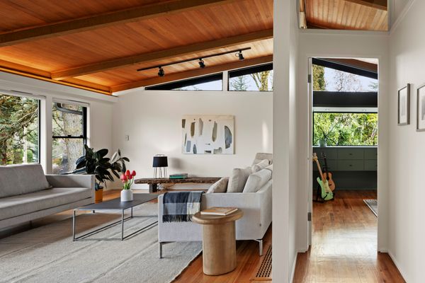
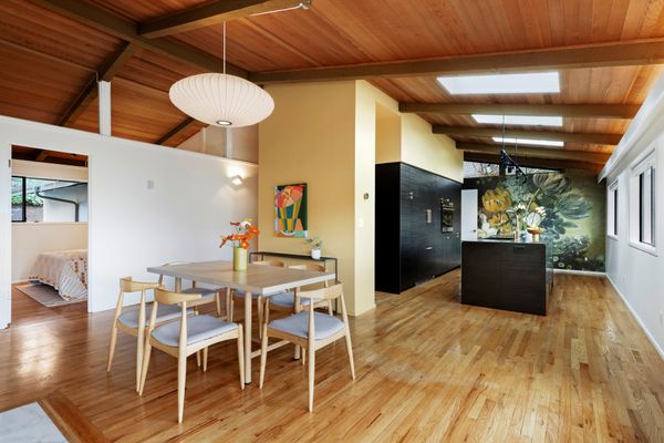
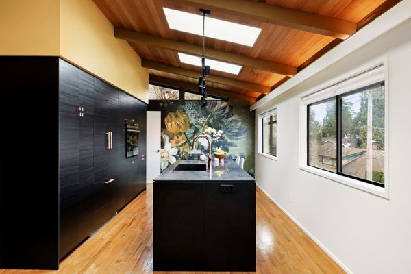
The Pacific Northwest home still has its original fireplace, clerestory windows, and post-and-beam ceiling—plus a slate-gray kitchen, a sunny studio, and a sauna.
From the Agent: “This midcentury-modern home sits on a corner lot in a fantastic Council Crest location in Southwest Portland. The gate opens to an intimate courtyard patio with multiple outdoor entertaining and dining areas. The interior features original cedar-lined ceilings with heavy beams, large windows, a white brick fireplace, and large clerestories lining the roof’s gabled ends. The remodel added additional interior clerestory windows which transmit light while maintaining acoustic privacy, and recessed lighting that kicks a warm glow onto the extensive vaulted ceilings. Other improvements include a studio with a cantilevered bay window and custom cabinetry in a blue-green color that compliments the rich wood tones. There are three bedrooms (one being the studio) and two baths upstairs. The lower level was converted into an independent living quarters, complete with a contemporary kitchen, eating bar and bath, bedroom, living area with fireplace, media room, and private deck.”
The living area features original beamed ceilings and a large white brick fireplace.
Justin Jones / Jones Media Shop
Justin Jones / Jones Media Shop
Justin Jones / Jones Media Shop
The kitchen wallpaper is a print of Eelke Jelles Eelkema’s Still Life With Flowers from the Netherlands National Museum.
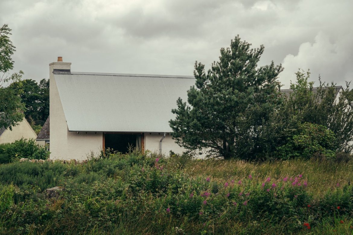
The 409-square-foot Highlands retreat combines clay with locally felled Douglas fir, which was used for everything from structural elements down to kitchen cabinets.
Houses We Love: Every day we feature a remarkable space submitted by our community of architects, designers, builders, and homeowners. Have one to share? Post it here.
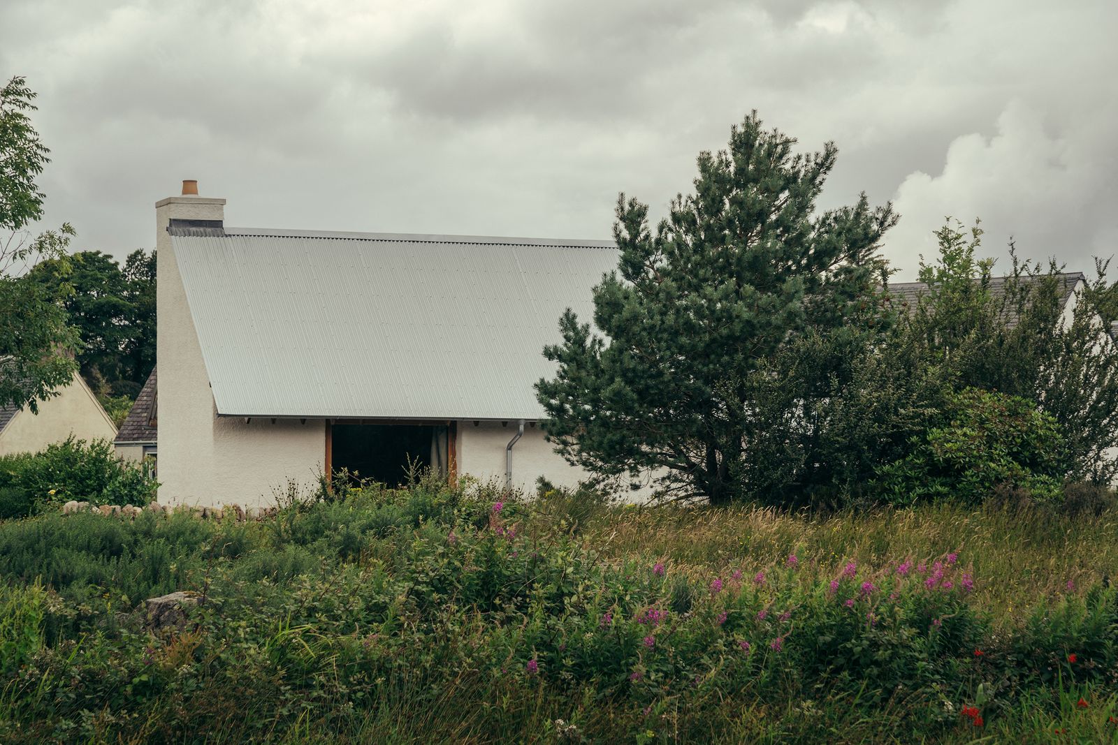
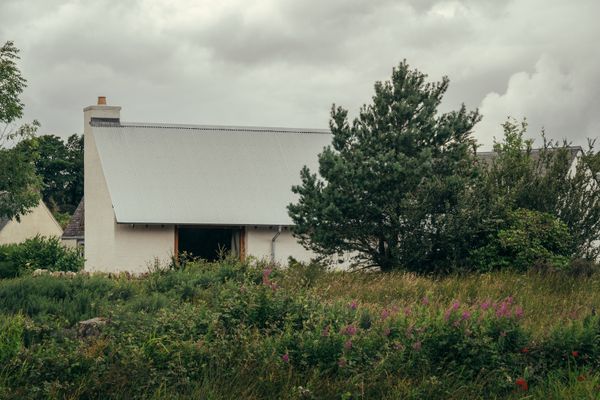
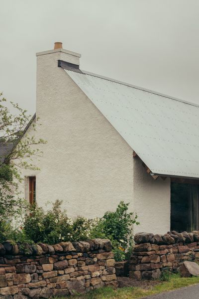
From the Architect:“Iorram is a contemporary take on a traditional cottage in the Scottish Highlands by Baillie Baillie Architects. Celebrating the use of local timber as well as local tradition, Colin and Megan Baillie designed and built the house for themselves, creating a compact holiday let that allows them to share the virtues of sustainable design and craftsmanship.
“The self-build project took a low-tech, natural materials approach, using monolithic clay block walls—a material which is simple to build with, durable, and completely plastic free. Scottish Douglas fir, sustainably felled and milled in the Highlands, was used for all timber structural elements, wall linings, and details. Baillie Baillie minimizes waste material by using timber offcuts as mortised doors and kitchen cabinets.
“Despite a compact internal area of 409 square feet, Colin and Megan wanted to show that they could create a feeling of generosity, which is achieved through varied qualities of light and volume, as well as the use of warm, tactile materials. Apertures are configured sparingly with a single large east-facing window angled to take in the landscape with long views across the bay and low-morning sun.”
One-color interiors are all the rage right now, but mastering the look takes more than just a can of paint.
A recent trip to a bar decorated completely in various shades of purple left me feeling underwhelmed by the execution. Despite being saturated by various delicious shades of purple-ish, reddish hues, the room lacked the cohesion and visual impact I’d expect from such a choice. This particular space could’ve been an absolute moment—but the subtly clashing hues threw the design off entirely and something about the draped LED chandelier lights made the colors feel flat and one-dimensional. While these were obvious faux pas to my barely trained eye, I wondered what could’ve been done to remedy these issues (or avoid them in the first place).
As it turns out, monochromatic doesn’t always mean just one color–including a different color might’ve breathed more life into this aesthetic. And judging by the aforementioned monochromatic mishap, there’s more to this process than saturating a room in a single color and calling it a day.
This isn’t quite color drenching, but something a bit more nuanced. We spoke with Kasandra Rafter, founder/designer of Canyon Creative Design and Andrea DeRosa, co-founder and CEO of Avenue Interior Design for all the ins and outs of properly tackling a monochrome palette.
The perks of a single-shade palette
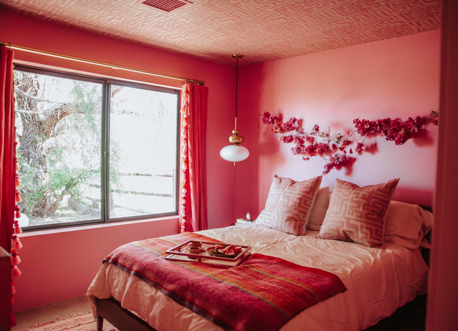
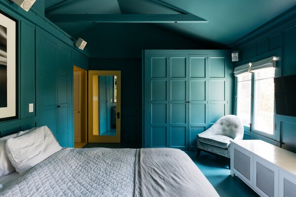
Painting an entire bedroom a calming cerulean creates visual impact without being busy.
Photo by Jen Woo
In DeRosa’s opinion, monochromatic palettes are a rare occurrence in interior design and the impact it makes serves as one of its strongest advantages. Opinions vary on whether monochrome decor skews too cold but those who love the trend have described it as “calming,” lauding its ability to create a coziness caused by the intentional focus on a sole color.
“Monochromatic interiors have an allure and mystery to them—they are undeniably powerful, almost drawing you in,” DeRosa says. “They are also more curious, complex and almost confident in nature.”
Finding the perfect monochromatic color and room placement
In a world where beige and grey interiors reign supreme, a fascination with the creative application of colors almost feels radical—but the best monochromatic palette designs require a bit of outside-the-box thinking. If not, you run the risk of creating something boring, which Rafter says can be avoided by paying attention to undertones and using an accent in the room as the foundation for the color palette.
In this room designed for the homeowner’s cat, pink suffuses the space with warmth, while the Pandomo surface adds texture.
Photo by Hey! Cheese
“If the undertones don’t align, the entire space can feel off,” Rafter explains. “Start with a single anchor—whether it’s the perfect sofa fabric, a rug, or a piece of art—and then build the palette around it by layering in varying tones of that color.”
Before you take the paintbrush to your tiny bathroom, bedroom, or entryway, a word of caution. The monochrome technique works best in specific spaces. According to DeRosa, the room size and ceiling height could make or break the design.
“If you have a very small space, a space without natural light or an abundance of ambient lighting, or if you have a low ceiling height, the space tends to feel confined when limited to a single color.”
On the other hand, Rafter recommends the tonal approach for bedrooms and living rooms for a space that soothes the senses.
‘We love using monochromatic palettes in formal living rooms and serene bedrooms. In a living room, deeper tonal ranges—like inky blues or charcoals—can instantly elevate the space and give it a rich, refined feel,” she says. “In bedrooms, soft tonal palettes can create a sense of calm and quiet—think layers of ivory, oatmeal, and putty. It’s a look that’s both restrained and deeply intentional.”
Make it multi-dimensional
So you’ve selected your color and decided which room will get the all-beige-everything treatment. But by the time you’re done decorating, the design falls flat. That stylish cream sectional practically melts into the cream backdrop, plus you can hardly tell where the drapes begin and the complementary lamp shades end. It could be that you overlooked tones and textures, a key to creating the perfect monochromatic look, Rafter says.
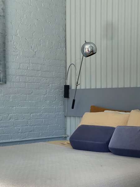
The texture of painted brick plays well against the headboard, painted in a complementary but darker shade of blue.