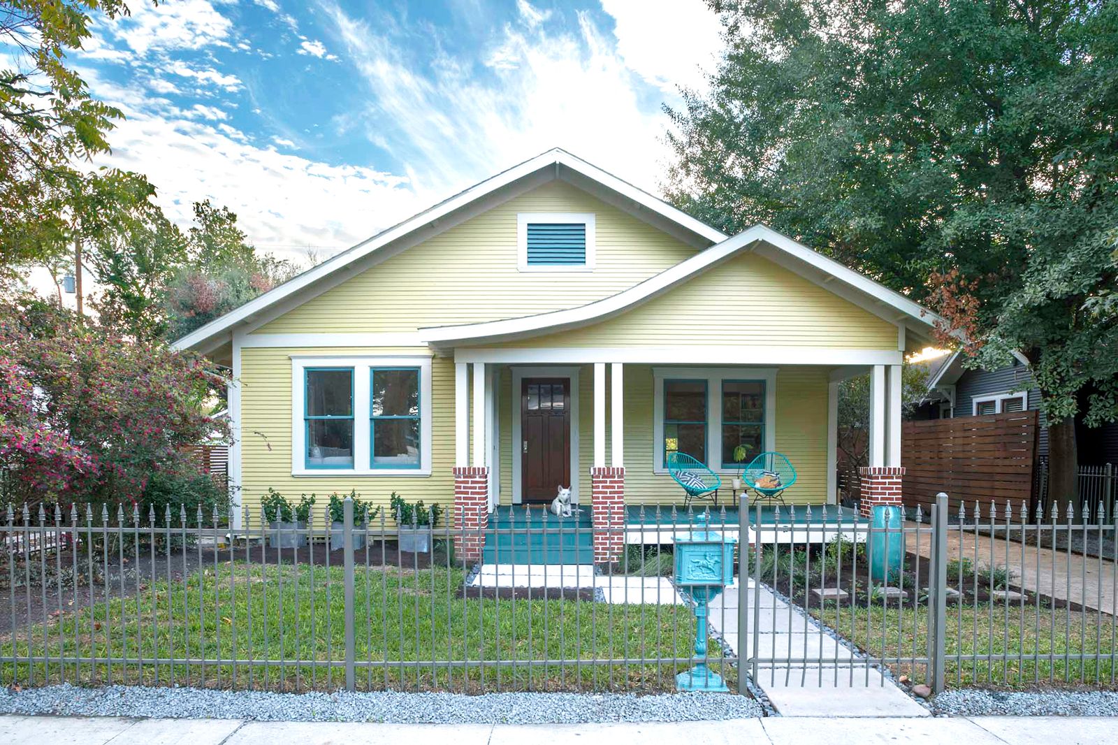
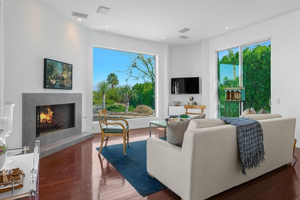
Inflection Architecture adds 700 square feet to a century-old Texas bungalow by tucking a new second story just beyond street view.
Janette Lindner first bought this Houston, Texas, bungalow 20 years ago, before she and her husband, Fred, got together. “She allowed me to move in,” Fred says with a laugh. The pair made some small tweaks to the interiors to make the 1930 home more comfortable for a modern age, and they lived there, two young adults in love, happily for years.
Smash cut to 2020. The Lindners were still happy in their historic neighborhood, but they were also starting to feel a little cramped, now that they shared the house with their two kids, Andrew and Alex. “Covid really highlighted our need to expand the space and the function of the home to accommodate our growing family,” says Fred.
They started dreaming of a more functional layout, with separate rooms for each of the kids, office spaces to accommodate the grown-ups’ hybrid work schedules (Janette is a management consultant; Fred is a brand and software designer), and a new laundry room. The catch? They didn’t want to give up too much of the backyard to make it happen. “Outdoor space is important to us,” says Janette. Oh, and any changes needed to be in keeping with the scale and character of the neighborhood.
For some, this might have been a tall order, but Kristin Schuster, principal of Inflection Architecture, approached the challenge with excitement. “They had this darling little historic bungalow that they really cared for a great deal and had worked hard to make work for them,” she recalls. “The house was bursting at the seams with vibrant, colorful stuff everywhere, and I remember thinking, ‘Okay, there’s a way to find the place for all of these things and all these people that is going to help them stay connected.’”
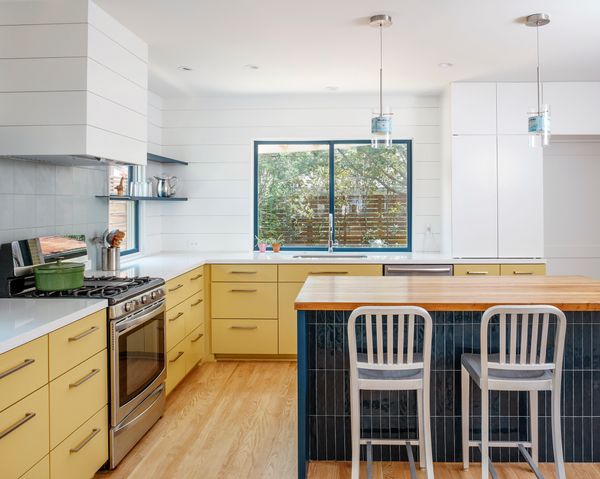
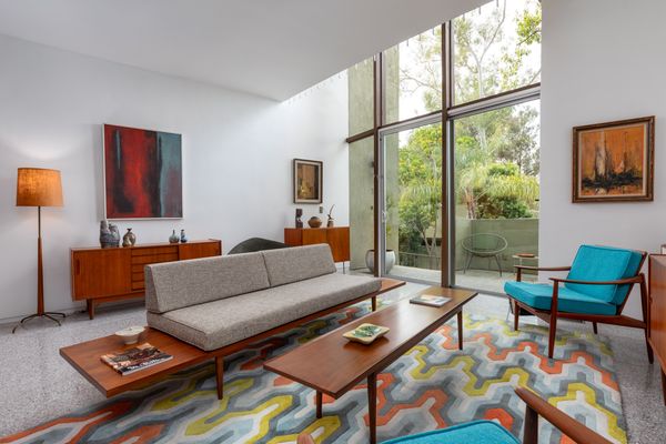
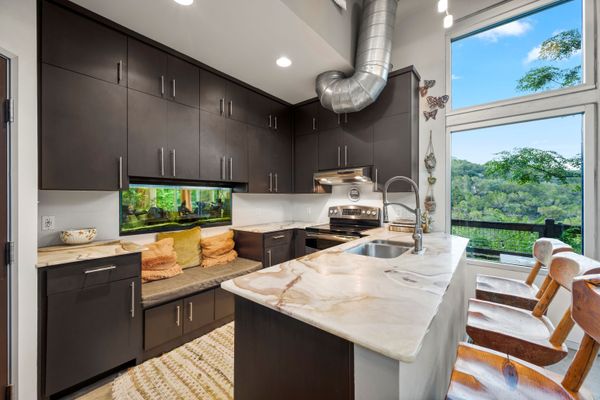
Working with Schuster, the family settled on plans for a new-build second story that would bring the 1,200-square-foot bungalow up to 1,900 square feet, with three bedrooms and plenty of space for family music jams and creative pursuits. Schuster placed bedrooms for Alex and Andrew up on the second floor, along with a shared bath and play space, which allowed her to reconfigure the ground level more effectively and make use of shared, overlapping functions.
“All these spaces connect through looping circulation or sneak-peek openings that borrow light and views and let everyone feel as connected as they want to be while they are home,” says Schuster.
Living in one of Houtson’s more restrictive historic districts, there were some limits on what could be done to the facade of their home, which was built in 1930. But the demolition revealed evidence that the home had once had a large front porch, so Fred took a 22-slide Powerpoint presentation down to city hall and got permission to add one back into the design.
The generous array, along with a rainwater harvesting system, allows the concrete residence to operate entirely off-grid.
Houses We Love: Every day we feature a remarkable space submitted by our community of architects, designers, builders, and homeowners. Have one to share? Post it here.
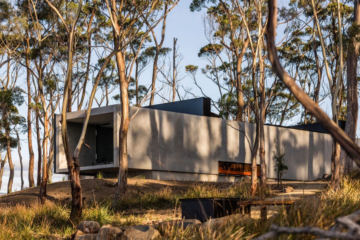
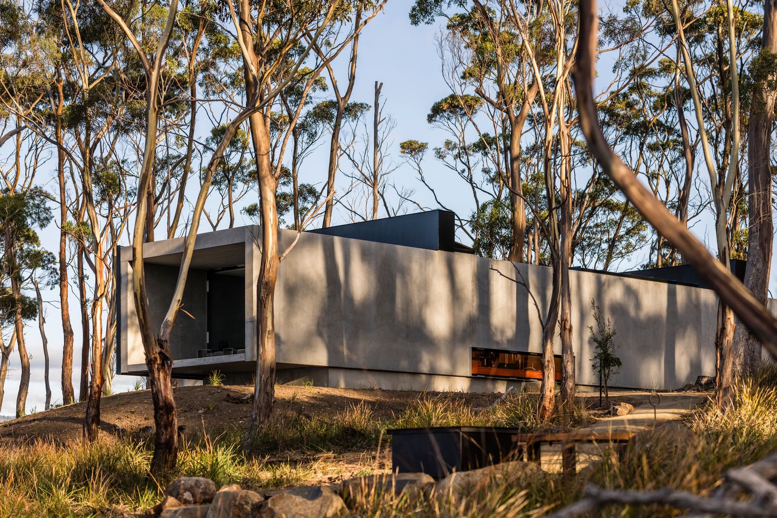
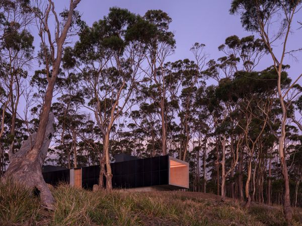
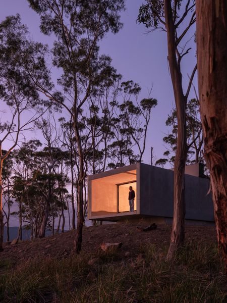
From the Architect: “Danish design brand Vipp traveled to the southern hemisphere for the brand’s newest guesthouse. Cantilevered over a sloping hill on Tasmania’s Bruny Island, the Vipp Tunnel by Hobart studio Room11 balances beauty and brutalism.
“Balancing on the edge between solid ground and open air, Vipp Tunnel expresses a playful dialogue between concrete cubism and its organic surroundings. The 1,722-square-foot home stretches 98 feet, and wall-to-wall glass and recessed steel doors provide unobstructed views of the surrounding landscape and sea. An atrium yard separates the main living space from the primary bed and bathroom, while at one end of the home, a glass door leads to a framed terrace floating above the land.”
“A separate 377-square-foot concrete cube with 13-foot-high ceilings referred to as ‘the studio’ offers an escape to a space of visual and sensory calm. Ideal as an office space or meditation room, its spare design highlights the architecture.
“Inspired by the area’s natural phenomenon known as aurora australis, or southern lights, when the night sky is transformed into a dreamscape of color, Room11 added chromatic glazing to the building’s central skylights. Polished concrete floors and walls further enhance the effect, reflecting the ever-changing interplay of light like an ever-changing artwork.
“Vipp’s new all-aluminum V3 kitchen anchors the home’s main space. With a monumental stainless steel counter and fluted aluminum doors, the kitchen island mirrors the materiality of the building’s architecture.
“Clad with an entire facade of solar panels facing west, the structure is energy-sufficient and runs off-grid. During the design process, Room11 conducted surveys of every tree on-site and articulated roadworks around significant trees. A narrow construction corridor was established so that the impact on endemic vegetation was kept to an absolute minimum. The concrete panel design provides a thermal insulation to keep a regular temperature throughout the year, minimizing the use of heating and cooling sources. The getaway is purely run off rainwater and self-sufficient energy.”
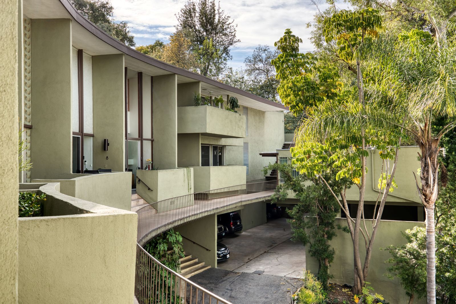
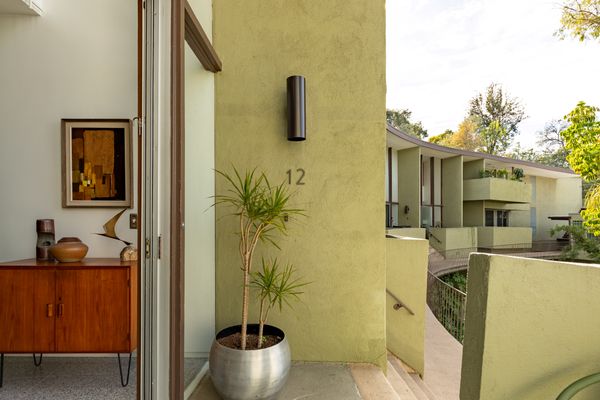
From the Agent:“Two stories of glass, nine-foot ceilings, and spectacular views subsist in this Hollywood Hills condominium bordering Studio City designed by architect and educator Ray Kappe. The home measures 1,254 square feet, and each element of the living areas, bedrooms, and baths is masterfully planned, functional, stylish, and timeless. The neighborhood is close to dining and entertainment, and the home is freeway convenient to the studios, Valley, and all your favorite places in L.A. Soft story retrofitting is complete, the roofs are one year new, and the HOA dues cover the building’s earthquake and fire insurance, as well as a monthly contribution to the reserve, pool, and more. Rarely is such a true piece of Los Angeles midcentury-modern architecture offered at a price like this.”
Famed architect Ray Kappe designed more than 100 residences over the course of his career.
Shawn Bishop
The condo is located in a 12-unit building with access to a private pool.
Shawn Bishop
The patio windows stretch from the floor of the first level to the ceiling of the second.
A slab sourced from a bowling alley in upstate New York makes for a durable, history-filled surface in this Brooklyn home.
Welcome to How They Pulled It Off, where we take a close look at one particularly challenging aspect of a home design and get the nitty-gritty details about how it became a reality.
It’s not every day that you put the wood flooring of a former bowling alley in a residential kitchen—even for architect Lindsey Wikstrom, whose New York–based firm Mattaforma specializes in sustainable sourcing, including using reclaimed and renewable materials. But when clients Laura (an Emmy-award-winning TV writer) and Darryl (a lawyer) connected with her and expressed their interest in using “materials that brought stories with them” fortheir home in Ditmas Park, Brooklyn, reclaimed wood felt like the right choice.
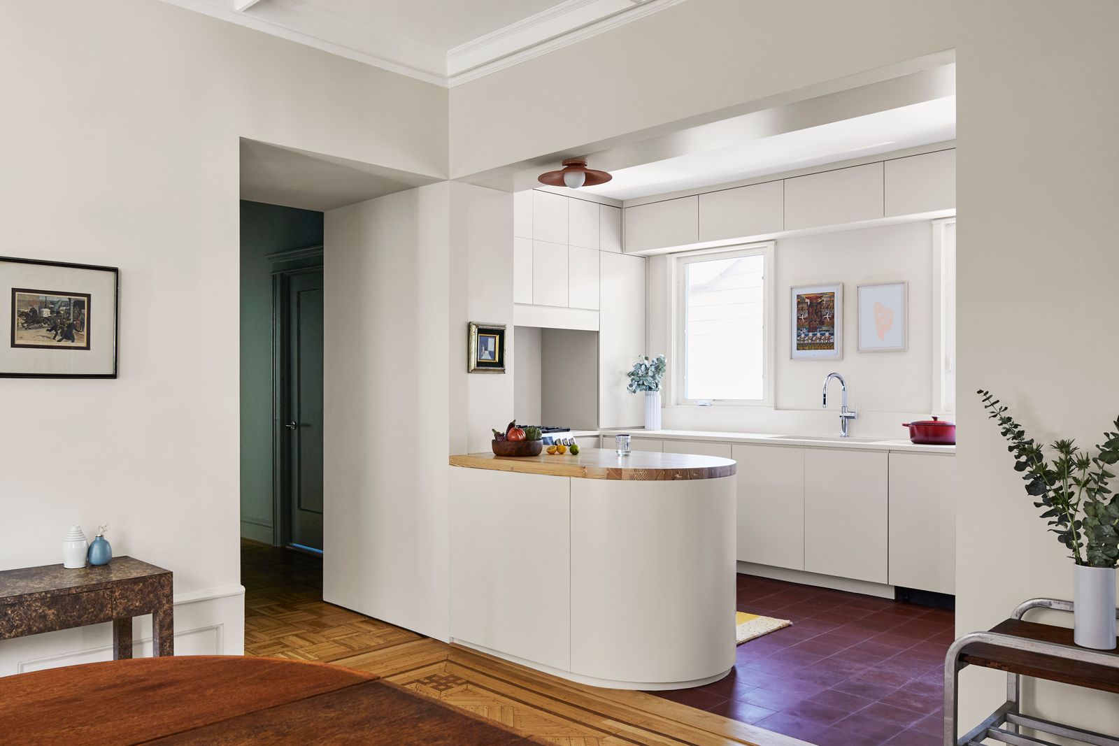
The kitchen was designed with off-white cabinets. Touches of wood and saturated reds in the lighting and flooring add warmth. “We helped them find the right balance of colorful and calm and woody for them,” notes Wikstrom.
Photo by Mattaforma
Laura, Darryl, and their two cats, Gus and Hammy, sought to update their home but keep the quirky, historic detailing that made it feel lived-in and comforting. The duplex takes up two floors of a three-story wood-frame home originally built as a single-family, Victorian-style residence in the early 1900s. Over time, the house was converted into two units: one on the ground floor (which would remain untouched by Wikstrom) and a second unit on the second and third floors that was the focus of the renovation.
The three-story home in Brooklyn’s suburban Ditmas Park neighborhood was built in the early 1900s, and its traditional layout and historic detailing like original parquet flooring with decorative inlays was typical of the time.
Photo by Mattaforma
Wikstrom described the unit’s existing condition as “very outdated” and inefficient. Circuitous routes led through the kitchen or living and dining areas in order to reach the bedrooms, and the kitchen, with its dark wood cabinetry and granite countertops, hadn’t been renovated in decades.
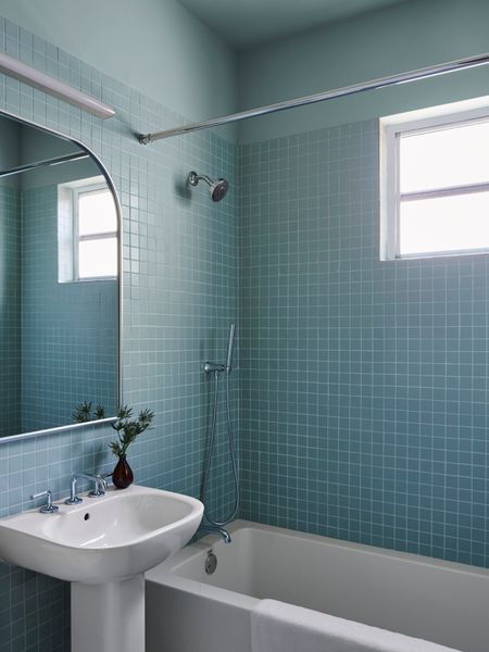
“For all rooms, the client and our team were dedicated to the idea of color immersion, especially in small spaces like the bathrooms and hallways,” Wilkstrom explains. The guest bath, for example, is covered in sea green, from tiled walls to painted ceiling.
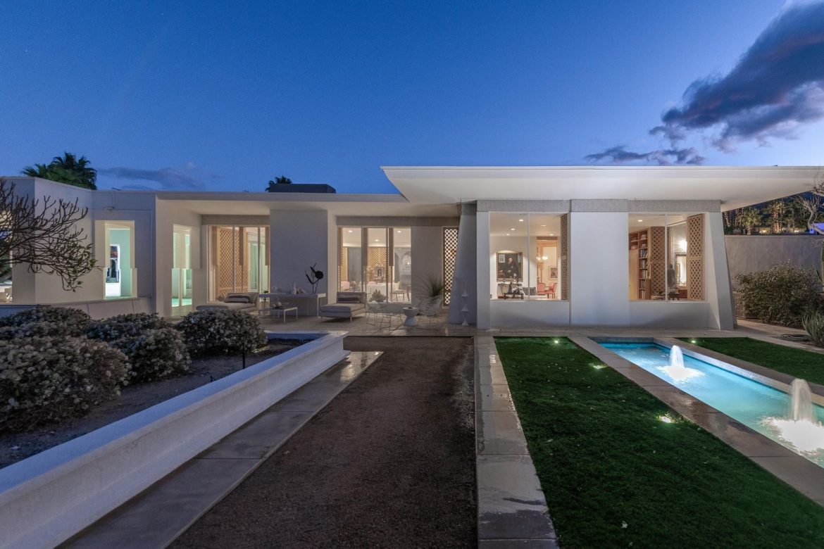
From the Agent: “A rare and extraordinary offering designed in 1957 by renowned architects Henry Eggers & Walter Wilkman for Thomas B. Davis, White Shadows stands as one of the desert’s most revered architectural masterpieces in Thunderbird Heights. Set behind private gates on an elevated acre, the estate boasts panoramic views of the valley floor and surrounding mountains. A sun-drenched courtyard, highlighted by a striking fountain, serves as the home’s dramatic centerpiece, seamlessly blending indoor and outdoor living. This is a once-in-a-lifetime chance to own an iconic estate where historic modernism meets timeless sophistication, all set against the breathtaking backdrop of the desert landscape.”
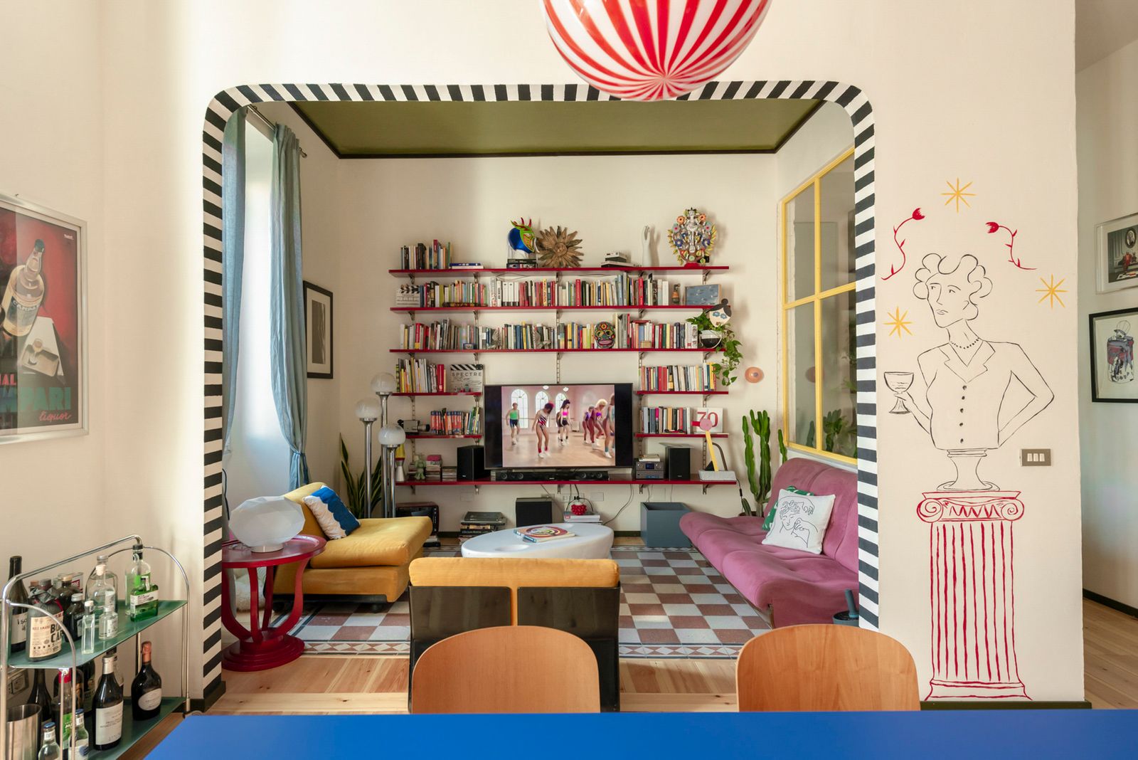
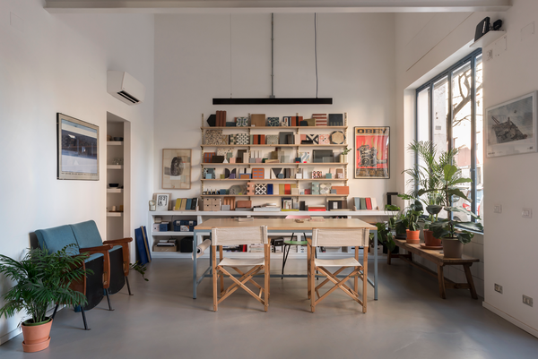
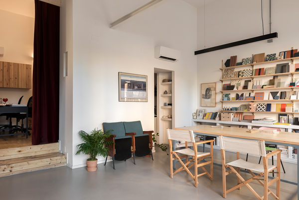
The “Aladdin Sane” reference adds to the irreverent apartment’s bricolage of checkerboard, splashy color, and eclectic shelving.
Houses We Love: Every day we feature a remarkable space submitted by our community of architects, designers, builders, and homeowners. Have one to share? Post it here.
From the Designer: “Sometimes when renovating a home, one wants to achieve a result that does not look new and freshly packaged, but has the flavor of something already experienced.
“This renovation was the request of two creatives. We transferred their family’s playful and whimsical imagery into spaces that would contain, without too many rules, what they love and what makes them happy. The home is in the Villa Fiorelli area, in a social housing development. The floor plan is L-shaped, with an entrance on the long side and windows arranged on another, a typical corridor layout with rooms in a row.
“Directly through the entrance is a central room with a living space on one side and a kitchen on the other. The hallway continues to the left of this central area, punctuated by three arched doors lacquered in sugar paper that grant access to two bathrooms and a first bedroom. On the opposite side, separated by a full-height swing door, are two more bedrooms.
“The eclectic, layered style links vintage elements with industrial-flavored grafts, antiques, and custom-designed furniture. Added to this are pictorial interventions made by the owner: geometric frames, and optical motifs that mark the doorways or decorate the walls. The floor is made of larch planks, and the walls have a rough finish—a lime-based IG 21 that dialogues with the rest of the home.
“The result is a welcoming yet awe-inspiring environment, an enthusiastic synthesis of the diverse humanity that will inhabit it.”
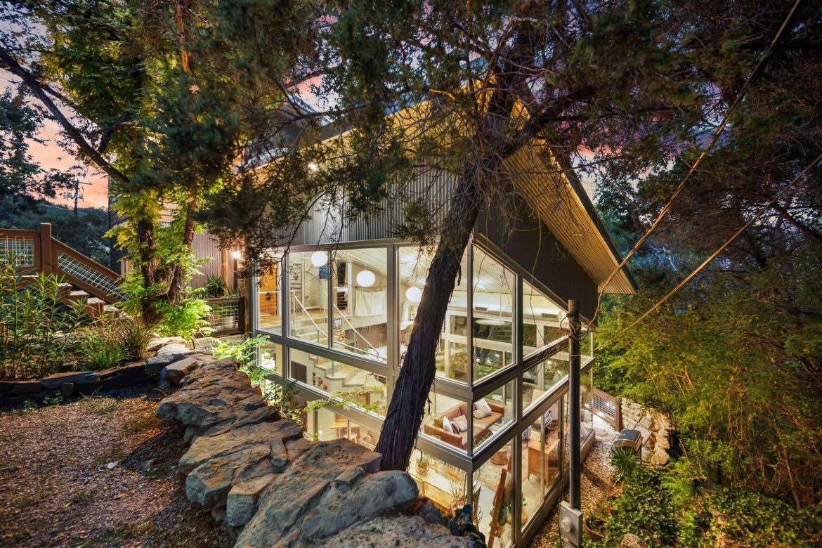
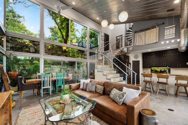
From the Agent: “A unique glass tree house feel and a magical experience await you as you step down the custom slate stairs into another world. This contemporary four-bedroom, three-full-bath Luxor Custom Home is unlike anything you have seen with glass walls that stand over 30 feet tall. A metal roof, steel construction, commercial grade doors, Honey Onyx countertops, a moss rock shower, Calcutta marble countertops, and marble floors are only a few of the luxurious features. Rock walls at this home carved into the side of a cliff give it a pretty private and serene setting. Located in the trendy community of Apache Shores, the home is five minutes from Lake Travis and three minutes from Lake Austin.”
The living area is framed by glass walls that reach a height of 30 feet.
The duo overhauled the roofless stone structure with custom built-in furniture and a balcony overlooking the old town of Dhërmi.
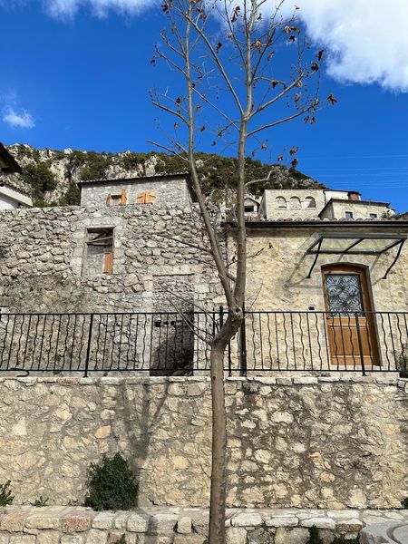
As children, Erazmia and Anxhela Gjikopulli reveled in summers at their parents’ house near the beach in Dhërmi, an idyllic Albanian village some three hours south of Tirana, the capital. So, when their father bought a dilapidated building in the historic center, the ambitious sisters were keen to transform it into an inviting home and forge new memories.
“For as long as we’ve been coming to Dhërmi, it’s looked like a ruin,” says Erazmia of the once-neglected structure. In the past, it was used for storing and pressing olives, but for Erazmia and Anxhela it evokes nostalgia on a more personal level because it neighbors the home their grandparents resided in before they abruptly left during communism.
Before: Facade
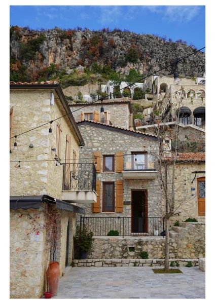
At first, Erazmia, a Tirana-based architect and urban designer, and Anxhela, who works as a product owner in Munich, envisioned the renovation unfolding as one commodious, duplex-style apartment. Ultimately, they decided to create two pieds-à-terres—Sea Apartment 1 and Sea Apartment 2—one for each of them to relish in between guest bookings managed by their mother.
After: Facade
The sisters preserved the structure’s outer stone walls in a nod to the village’s characteristic architecture.
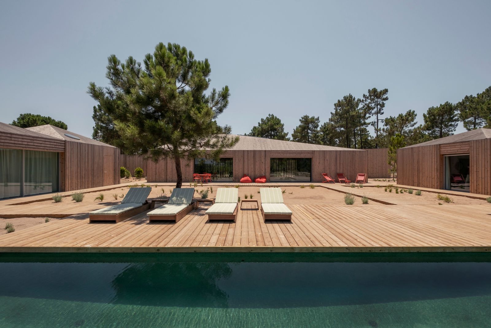
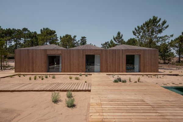
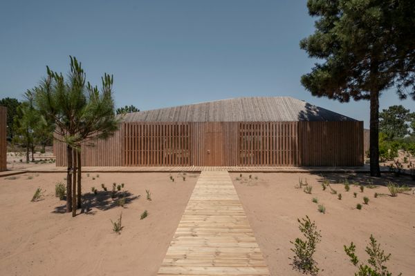
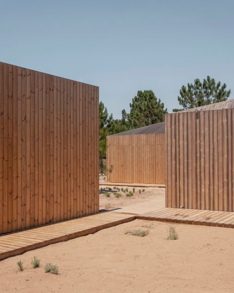
The slatted-wood structures and their network of boardwalks are arranged to preserve a surrounding pine forest.
Houses We Love: Every day we feature a remarkable space submitted by our community of architects, designers, builders, and homeowners. Have one to share? Post it here.
From the Architect: “Nestled between the serenity of a pine forest, this project captures the essence of Comporta’s landscape. Inspired by the sun, the area’s fishing traditions, and the raw beauty of the region, the design reinterprets humble fishermen’s wooden huts found in Carrasqueira, Portugal.
“The project’s guiding principle was an ecological commitment to preserve and respect the existing pine forest. Rather than clearing land, the cabins are delicately placed within the natural voids of the trees, allowing the landscape to dictate the architecture. A palette of natural materials—wood, cement, and plaster—grounds the design in honesty and simplicity, echoing the ethos of truth to materials.
“The architecture is composed of five distinct volumes, each designed with precise functionality and spatial articulation. These volumes are interconnected by a network of elevated wooden walkways, minimizing disruption to the forest floor and reinforcing the dialogue between built and natural environments.
“The day area, organized in the central volume, is a multipurpose space that consolidates living, dining, and kitchen functions under a unified roof. Designed with expansive glazing, this volume fosters seamless transitions between interior and exterior spaces, capturing views of the surrounding forest and rice fields.
“Two auxiliary volumes complement the day area. To the west, a gym space is oriented to embrace the setting sun. To the east, an open garage marks the entrance to the property, balancing functionality with a restrained architectural expression.
“The sleeping area is distributed across two volumes, emphasizing privacy and retreat. The first volume accommodates the primary bedroom and an en suite guest room, each benefiting from direct access to the exterior walkways. The second volume, dedicated to additional bedrooms, is designed for adaptability and comfort, ensuring a cohesive relationship between all the spaces.
“At the heart of the composition lies the swimming pool deck, an open-air courtyard bordered by the volumes. This space anchors the design, creating a dynamic environment where daily life unfolds. The interplay of water, light, and natural materials transforms the courtyard into a contemplative retreat, further integrating the architecture with its surroundings.”
The brand is often most associated with low-cost furnishings. But its higher-end line has a rich history.
Your earliest familiarity with Ikea may vary, but mine was reading the catalog at my best friend’s house around age 10. I was always impressed with the cool stuff her family had, and when I found out you could order it from a catalog, and not just get it from a store (or pick it off the street, which is how my family found much of our furniture in New York City), the intrigue only continued. I’ll always remember the day I got my treasured first item from the brand—a mosquito netting canopy for my bed, the ultimate in cool for a middle schooler.
It wasn’t until I went to college that I got to fully avail myself of its offerings. Driving to the Chicago suburbs to pick out a coffee table and a desk for my new apartment felt like true adulthood, despite the fact that the car we drove to get there didn’t have power steering, a radio, or air-conditioning. This is the association that might stick in the minds of many Americans when they think of Ikea—the first time you’re able to buy furniture of your own, and it better be cheap, but it’d be nice if it was chic.
This solution they’d created for their audience—being able to buy design-y furniture at an affordable price—was once a problem for Ikea. What would they do when their demographic aged out of their wares? That’s why their Stockholm collection was born in the ’80s, featuring leather sofas and chairs, glass-fronted cabinets, and Nordic birch wooden furniture with hidden fittings. “What could the company offer all those people who had grown out of their low pine sofa, taken down their pop and protest posters, and moved their Ivar shelves into the garage?” the website explains, of the collection’s history. “They were looking for comfort and elegance, and [founder] Ingvar Kamprad came up with the solution: a ‘best of Ikea collection’.”
The company did, and still does, pride itself on the “democratization” of design. “The most beautiful Swedish furniture had long been reserved for a few: the rich,” a 1985 Ikea brochure reads. “Ordinary folk had to make do with poor copies or nothing at all. This doesn’t sit right with us.”
Since then, Stockholm has been released in seven editions, with the goal of providing “modern Scandinavian design of the highest quality, offered at an affordable price.” And in February, in an experience that would have awed college student-me, I went to, yes, the city of Stockholm to preview the company’s eighth for its 40th anniversary. The new collection—available to shop Thursday April 10th—is 96 pieces, and was inspired by both the Swedish capital and the immense nature just outside of it. It’s comprised of rich, deep colors with pops of surprising neons, sturdy woods, velvets, leathers, and smooth edges—a fit for the continued ’70s moment we find ourselves in.
During my interviews, I was particularly interested in learning from the designers about how they tailor Ikea’s ethos of price-first—they all start with a price band, and design a piece to match that—to create a higher-end product. In a collection like this, they have the opportunity to use more complex building techniques and more expensive materials, but the design ethos that is used in the least expensive items still informs all their products. (One thing they shared that they don’t have: a master database of all their materials and techniques, because it’s all learned, shared, institutional knowledge.) Because of the company’s scale, they are still able to produce items for low costs that would typically be challenging elsewhere, like the handblown glass vases in this collection, which, when produced at volume, become feasible. Here, in their own words, this year’s Stockholm collection designers describe what they were trying to accomplish in creating five of the collection’s pieces for the masses, ones that manage to feel personal to you.
These interviews have been edited for length and clarity, and all prices have been converted into USD.
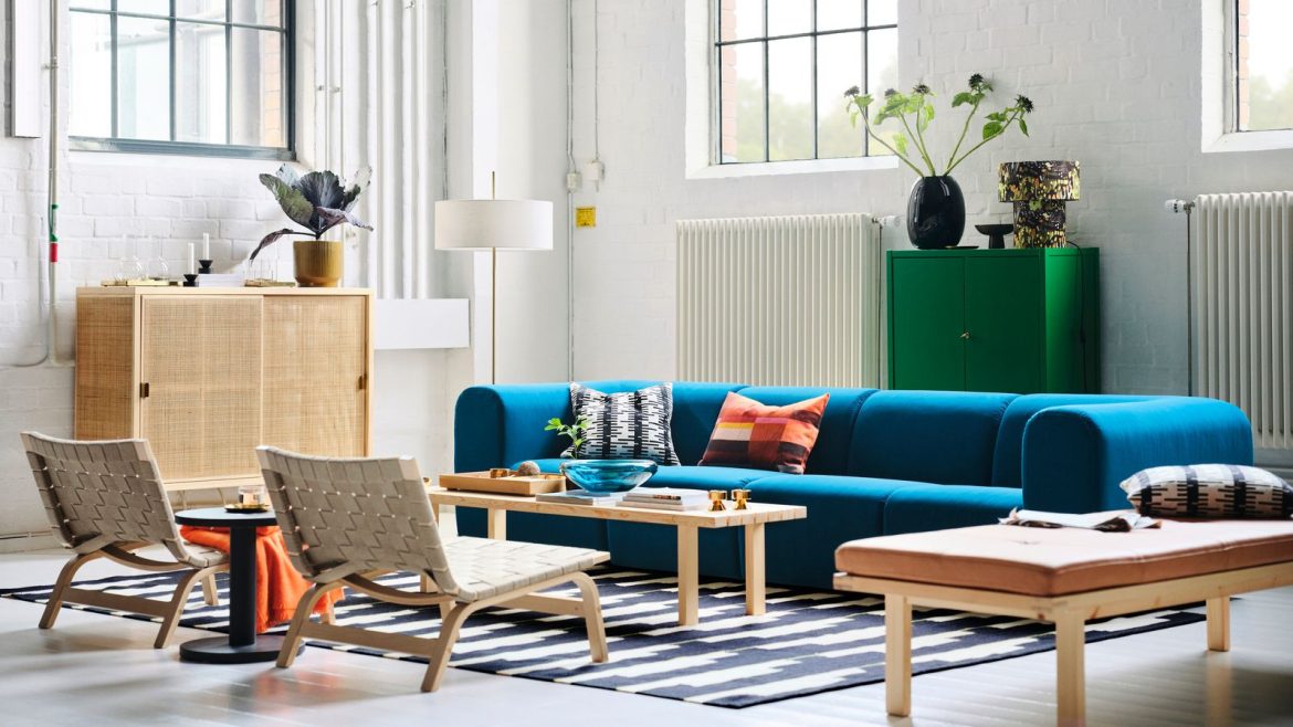
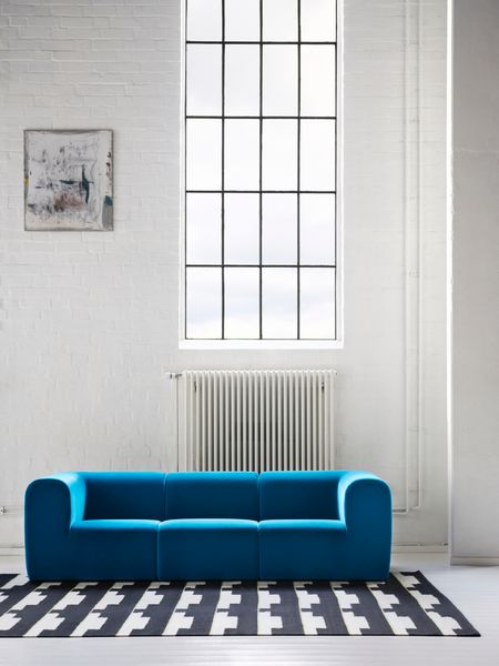
Available in dark turquoise, dark brown, beige and gray/white, this sofa can be configured into many sizes depending on which sections you purchase. Below it is a handwoven, 100 percent wool rug.
Courtesy Ikea
Stockholm 2025 Sofa
Ola Wihlborg, designer: We can start with the sofa, because the whole collection started with sofas. Because we wanted to find something that sets the tone and that’s also the piece that sets the tone in the living room. It’s a big piece.
So we started the sketch of the sofa—it was [fellow designer] Nike [Karlsson] and I—and the starting point for me was my sofa at home. I have a sofa from a previous Stockholm collection with a lot of cushion inside. We always fluff these cushions and make them in order for the night. And now we have a lot of kids and we have a dog and the cushions are all over the place. So the idea was to do a new sofa that looks the same all the time.
It’s quite tricky to find a shape and a material that also has comfort. It’s easy, it turns out, to be something that is just hard. So I started to find these soft shapes and I sketched the shape in soft materials also. We’ve done the shape in Älmhult [Ikea’s headquarters] in the pattern shop, and when we finalized the shape and we were satisfied, we sent the shapes to the supplier where we made a lot of samples to try out the right comfort.
We have a spring core with the springs inside the center, and then we cover it with a cold molded foam shape. That makes it also very durable. The cold molded foam will keep up the quality over a very long time. You can use the modules separately also, so you do not need to connect them. You can have them like an armchair also.
Karin Gustavsson, creative leader: We knew from the beginning we wanted a velvet.
Wihlborg: We started with velvet because we wanted the soft feeling.
Gustavsson: The colors pop much more in the velvet. And then the velvet is, I think it’s like 90 percent recycled polypropylene. And it’s a really good quality, high-quality velvet. We have a full textile team who develops the fabrics for us and they are so tested—they need to last a long time. And also not to be too much for dust. It’s antistatic. And the blue one came because we said we need a pop color—we need something to pop.
Everyone thought it was crazy. And then we did a brown one and everyone said, “Brown? Gray and black.” Because I love brown. And now it’s so trendy. And then we made the beige ones. Everyone’s so grayish otherwise.
Wihlborg: The cover is removable so you can wash it. And the bouclé came up when we made the armchair. For that one, it’s more tricky to find the fabric that we can cover this shape with. And that’s why we started with the bouclé and then when we saw the armchair, we said we need to have the same on the sofa.
Gustavsson: It’s so Scandinavian, it’s a little bit like this snow feeling. And it’s not too bouclé—it’s quite a dry fabric.
Wihlborg: We always have the price in mind when we start, not the exact price [but a range]. When you have that, you can see immediately, oh, we can’t go too big, we can’t go with that material. And you have a certain amount of money to spend. Of course sometimes you need to step out from that. But then you also have to explain why.
Gustavsson: We knew that Nike’s sofa was going to be, for us, a bit expensive. It’s $1,899.
Wihlborg: It’s more expensive than this one.
Gustavsson: We thought, for us, it was a bit expensive. And here you start at $1,299.
Wihlborg: For two.
Gustavsson: So you could say you get this one for $1,299 and then you add a mid-seat for $400. So it’s a quite good price for this one. Even to make a four seater, which you often cannot afford. The thing is also with this one, in a normal flat in London or Tokyo, you cannot bring a big sofa into the house because of the elevators. And you’re on the 12th floor, you cannot have someone carry [it up]. This one you can easily take piece by piece in the elevator. It’s also convenient for moving. We even did home visits just to see.
The other sofa in the collection is made of cotton/linen, leather and solid pine.
Courtesy Ikea
Stockholm 2025 Sofa
Nike Karlsson, designer: This sofa was really hard to make because I had so many different directions, but we ended up designing what we wanted to have. Then we met the supplier and we started to discuss: How should we build up the construction? How should we build the comfort? I said that maybe when we do this high-end product, could we also maybe try to reduce the amount of foam? Because foam is hard to recycle. And then the supplier came up with the idea of coconut fiber. They had it in other products—not for Ikea—but I thought it was something that we had in the ’50s or something that didn’t exist anymore. So that is what we have on the armrest, in between the frame and the fabric, is coconut fiber. And then in the seat portion we have this pocket spring. And then on top of that, they have, instead of foam, latex [from trees]. And that is super durable. When it comes to sit on it, it keeps the shape. So now we can offer this sofa with a 25-year warranty, because it is so durable.
The fabric, that was the trickiest one, because I was so worried that we couldn’t develop a new fabric for this sofa in the quality that I really wanted to have.
Paulin Machado, designer: You’re picky.
Karlsson: It’s so important what kind of fabric you can offer on the sofa. And then we also worked with the small pillows, how to make comfort without bird feather down or something like that. That is so nice. But you can’t do that, because of the animals and also people are allergic. These cushions are built in three layers. We have this block in the center with latex. And then we have fiber on that. And then we started to get a really nice feeling when you touch it, but it still, there was something wrong, because it didn’t sound right. So then they asked, ‘What is it that sounds on a feather pillow?’ It’s the cotton fabric that you have that is woven really, really tight. The pen crunch, it’s the crunch [of the feathers]. Could we add that fabric to get the right noise?
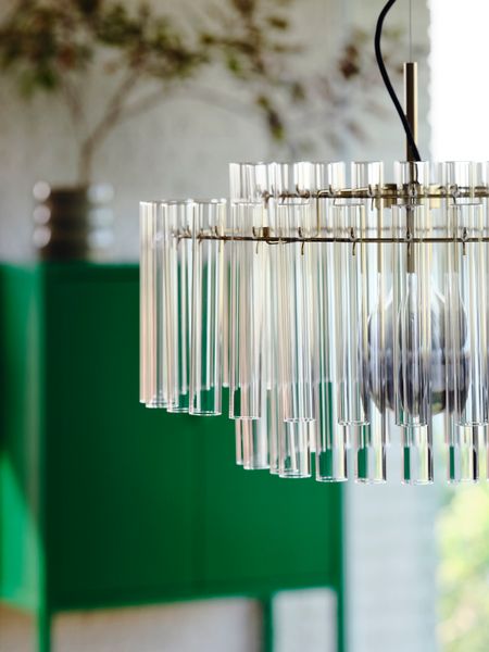
The glass pendant lamp comes in two different styles, one horizontal, the other more vertical.