large.jpg

This Home in the Czech Republic Feels Holy (and Is Literally Hole-y)

Hundreds of perforations in the facade create a mesmerizing display of light across the all-white interiors.

Houses We Love: Every day we feature a remarkable space submitted by our community of architects, designers, builders, and homeowners. Have one to share? Post it here.

Project Details:

Location: Borotin, Czech Republic

Designer: Jan Zaloudek Architekt / @jan.zaloudek.architekt

Footprint: 1,937 square feet

Builder: S – B s.r.o.

Structural and Civil Engineer: Projekty S+S

Landscape Design: Atelier Rouge

Photographer: BoysPlayNice / @boysplaynice

From the Designer: The House Oskar was built by designer Jan Zaloudek for himself and his family. Together with his wife, art historian and writer Jolanta Trojak, they long dreamed of a place to connect with the landscape or retreat inward. They envisioned a space that not only invites rest but also serves as a wellspring of creativity and inspiration—qualities integral to their everyday lives.

“Inspired by the idea of a chapel, which the village does not have, the resulting architecture is a blend of contrasts: new and old, interior and exterior, perfection and imperfection. The design respects the traditional elongated form of houses with gabled roofs, drawing on the vocabulary of local agricultural buildings. In reference to the area’s historical structures, the home has perforated masonry with openings for light and air.

“The compact form of the house is permeated by niches on each facade that reference Baroque morphology. These niches form entry vestibules and loggias, allowing flexible shading. The house can either fully open to the landscape, connecting its residents to the world, or close off to highlight its meditative character. The load-bearing structure consists of insulated ceramic masonry combined with reinforced concrete elements. The roof is clad with fired ceramic tiles, and the shading panels are made from whitewashed Czech fir and spruce.”

Photo by BoysPlayNice

Photo by BoysPlayNice

Photo by BoysPlayNice

See the full story on Dwell.com: This Home in the Czech Republic Feels Holy (and Is Literally Hole-y)
Related stories:

large.jpg

This $3.9M Midcentury on the San Francisco Bay Comes With a Boat Dock

Designed by Jack Finnegan, the waterfront home has a brand-new kitchen, restored floors and ceilings, and Japanese-inspired gardens.

Location: 205 Martinique Avenue, Belvedere Tiburon, California

Price: $3,850,000

Year Built: 1959

Architect: Jack Finnegan

Renovation Date: 2025

Renovation Designer: Suprstructur

Landscape Architect: Margot Jacobs 

Footprint: 2,808 square feet (4 bedrooms, 2.5 baths)

Lot Size: 0.23 Acres

From the Agent: “Designed in 1959 by Jack Finnegan AIA, this crisp midcentury-modern home is positioned at the head of a canal with distant views. The house has been comprehensively restored over four years with contemporary landscaping. The low-slung, delta-roofed house was designed at the end of the 1950s and was resolutely modern and avant-garde for its time. Sited at the head of a canal, the 2,808-square-foot house has extensive water views and its own private, deepwater boat dock. It’s been carefully restored over the past four years by Suprstructur, and new design elements have been thoughtfully incorporated into the building fabric so that they appear to have always been part of the architecture.”

Photo: Adam Rouse

The porch's lamp was repurposed from a mid-century church in Wisconsin, despite being manufactured across the bay in Berkeley in the 50s.

The porch globe light was repurposed from a midcentury church in Wisconsin—although it was originally manufactured across the bay in Berkeley in the ’50s.

Photo: Adam Rouse

Landscape architect Margot Jacobs took inspiration from Japanese stone gardens, mixing the design with Californian and Mediterranean plant life.

Landscape architect Margot Jacobs took inspiration from Japanese stone gardens while bringing in Californian and Mediterranean plants.

Photo: Adam Rouse

See the full story on Dwell.com: This $3.9M Midcentury on the San Francisco Bay Comes With a Boat Dock
Related stories:

large.jpg

How Did My Pandemic-Era DIY Bathroom Renovation Hold Up?

I joined thousands of Americans stuck at home and in need of something to do—and gained a passion that has stuck.

By March 2021, one year into the pandemic, I had painted, restyled, and DIY-ed my way from one end of my New York City apartment to the other. After countless YouTube videos, I can now swap out a faucet and install peel-and stick tiles, but I wanted to see how much farther I could go. Could I gut a bathroom for real? Stir crazy but not yet ready to rejoin society, I thought I’d find out.

To test myself and my new skills, I headed north to my parent’s home in the Hudson Valley. Here I would join the ranks of so many other Americans who contributed to the 44 percent increase in DIY home improvement spending through this period of the pandemic. My project was ambitious—a tiny four-by-eight-foot bathroom in their 1850s Victorian house. Modernizing a commode that was this old was a baptism by fire and made this project more difficult than it would have been in a more modern build. It took 10 times as long as anticipated but the result is both fresh and timeless enough that if you didn’t know, maybe it always looked like this. So how did my first major renovation go, and how has it held up through the first four years? 

The vision 

The design for the space was predominantly inspired by Sarah Sherman Samuel’s overhaul of Vanessa Carlton’s loft bathroom: walls with brick up top and marble below, checkered floors, and black-framed glass accents. I love how running the wall materials around the room, floor to ceiling, helped the room look much larger. I wanted to use zellige tiles for the top half but they were far too expensive for the volume of tile we needed, so we opted for a zellige-look ceramic tile made in Spain. 

Mixed tiles in varying shapes and materials but in the same color family make for visual interest without chaos.

Mixed tiles in varying shapes and materials but in the same color family make for visual interest without chaos. 

Photo: Kiran Chitanvis

For the bottom half of the wall, I got an excellent deal on 12-by-24-inch real marble tiles from what would come to be my favorite source, Floor & Decor. I then laid them out to try and connect veins across the various pieces. This helped to create the feel of a large slab without the cost. My mom didn’t want a checkered floor, so I found a square mosaic made of the same marble as the lower walls in a smaller scale square, like the zellige-look tiles, in order to create a cohesive materiality for the room. Once I picked up two different widths of marble pencil trim to run between each tile transition, it was set!

The process

The fun is just beginning!

The fun is just beginning!

Photo: Kiran Chitanvis

This, of course, is where the hard part began. First I had to rip out the floated laminate wood flooring, which revealed the original tile floor, horrifically damaged and covered in blackened adhesive from some past mini renovation gone wrong. At this point I also realized the floor was not level and would have to be fixed before I could tile. I cleaned it up as much as possible, rolled on some surface prep primer, and poured a thin coat of self-leveling cement right over the old floor into the sunken areas to even everything out. Turns out that stuff does exactly what the name says and was much easier to use than I anticipated.

A note about the walls: Original porcelain tile is so cool and beautiful and if I could have saved it I would have. But the existing tile was not in good shape up close. It was riddled with hairline cracks, and had chunks missing that had been back-filled with cement. As much as I loved the look, I knew it had to go.

In a perfect world, the vintage tiles would've stayed—alas!

In a perfect world, the vintage tiles would’ve stayed—alas!

Photo: Kiran Chitanvis

See the full story on Dwell.com: How Did My Pandemic-Era DIY Bathroom Renovation Hold Up?
Related stories:

large.jpg

A Renowned Artist’s L.A. Renovation Added a Distinct Facade—and Kicked Off a Much Bigger Project

The perforated metal screens that cover Charles Gaines and Roxana Landaverde’s house pay homage to the grids found in Charles’s best-known work.

When you see them from the street, the perforated white metal screens seem a little on the nose. Layered onto the facade of the house that artist Charles Gaines and his wife, Roxana Landaverde, a historian focusing on Mesoamerican and Mexican art, are renovating, they look conspicuously like the grids that form the basis of Charles’s celebrated work. “I never really thought about it,” he says of the resemblance as we prepare to tour the house on a beautiful Los Angeles day in April. I’m not sure I believe him. But in any case, the screens are the unifying element in what has become an ambitious building project.

Artist Charles Gaines plays the piano in the Los Angeles home he shares with his wife, art historian Roxana Landaverde. For years, a piano took up most of the living room until they asked TOLO Architecture to expand the space. The project eventually included adding a series of distinctive metal screens to the facade reminiscent of Charles’s work.

Artist Charles Gaines plays the piano in the Los Angeles home he shares with his wife, art historian Roxana Landaverde. For years, a piano took up most of the living room until they asked TOLO Architecture to expand the space. The project eventually included adding a series of distinctive metal screens to the facade reminiscent of Charles’s work.

Photo: Daniel Dorsa

Layering things has been part of Charles’s work for decades. Beginning in the 1970s, he has created pencil drawings that plot a system of numbers rendered in corresponding colors on graph paper, with the clusters of filled-in cells forming the shape of, say, a tree. It was an unusual mix of a conceptual system underpinning a kind of representational art, and it undermined what Charles calls a false contradiction between intellect and affect. The numbers, with their analytical order, contrast with the colors and their emotional associations. But overlay them on top of one another and they add up to a legible image.

Photo: Daniel Dorsa

Charles compares his systems to musical notation. He played drums in various jazz groups in high school and college, and he now plays the piano avidly—Erik Satie is a favorite—though he is humble about his talent. It was a piano that led Roxana and Charles to renovate the 1990s home where they have lived for 20 years in the Mount Washington neighborhood.

A pendant light by Jorge Pardo hangs above the living room (opposite), while one of Charles’s pieces hangs next to the fireplace.

A pendant light by Jorge Pardo hangs above the living room, while one of Charles’s pieces hangs next to the fireplace.

Photo: Daniel Dorsa

See the full story on Dwell.com: A Renowned Artist’s L.A. Renovation Added a Distinct Facade—and Kicked Off a Much Bigger Project
Related stories:

large.png

From the Archive: When It Comes to Renovating an Eichler, How Much Change Is Too Much?

More than two decades ago, we wrote about what it means to restore an architectural classic, using superfans of the legendary midcentury tract houses as a case study.

As a part of our 25th-anniversary celebration, we’re republishing formative magazine stories from before our website launched. This story previously appeared in Dwell’s January/February 2004 issue.

In the 1950s and 196os, developer Joseph Eichler brought modern architecture to mass-market suburban houses. Built by the thousands in Northern California, and in smaller numbers in Southern California, Eichler homes faced the street with modest, usually windowless facades. They had flat or low-pitched roofs, post-and-beam construction, and flat front doors that often led into open-air atriums. The blending of inside and outside continued at the back of the house, where the living room and backyard met in a wall of glass.

“The whole idea was to have a simple, geometric design that was really subdued relative to the nature around it,” says Frank LaHorgue, who worked for the developer in the 1960s and now lives in an Eichler home in Marin County’s Lucas Valley neighborhood.

Architecturally distinctive but popular in their day, Eichler homes epitomize nice modernism. But for all his aesthetic idealism, Eichler was a businessman with a knack for marketing. He attracted buyers not with rigid theory but with the promise of pleasure: affordable houses suited to the way real Californians lived.

Nearly a half century later, the drive to preserve Eichler homes is casting modernists in an unaccustomed role. Typically, people who want modern homes run up against city regulations or neighborhood design guidelines that restrict buildings to “authentic” or “compatible” forms and materials. In this scenario, neighborhood preservationists are the bad guys, squelching creativity in an attempt to freeze architecture in the past while the modernists are the nice nonconformists. In Eichler neighborhoods, however, modernists are the conservatives. They’re the ones talking about authenticity and compatibility, trying to stamp out any colors, forms, materials, and alterations opposing the master’s vision.

In Lucas Valley, the homeowners’ association’s design review guidelines dictate vertical wood siding, plain doors, and a palette of grayish earth tones. “With sixteen Eichler home designs and twenty five approvable colors, in thousands of possible combinations, individuality is easily attainable,” declare the guidelines. Tell that to someone who wants a yellow house.

After decades of design review, Lucas Valley looks remarkably consistent. But LaHorgue notices the aesthetic deviants—products of slack enforcement or outright defiance—and they bother him: white paint, panel doors, “decorative copper goodies attached to the front of the house,” a fence of plastic panels. The neighborhood, he says, is “a lot different than it was originally.”

Eichler fans disagree about how much change is too much. Down in Palo Alto, Carroll Rankin sounds every bit the purist. “These houses are structurally honest,” says Rankin, a retired architect. “If you accept such a thing as style in architecture,” he says, “you are in trouble with authenticity.”

Like LaHorgue, Rankin serves on his association’s architectural review committee, and he has campaigned unsuccessfully for tougher city controls. But as we walk out his front door into his atrium, I notice that the door has panels and is lit by a coach lamp—affronts to LaHorgue’s version of authenticity.

Who, then, gets to make the design rules, and using what standards? The answer depends, in part, on why you want to preserve Eichlers in the first place. Is it because their architecture represents some higher good? Or is it simply because people love them?

In broader terms, can modernism be one style among many, offering pleasure and meaning to some while leaving others aesthetically unimpressed—or ready to sue? To put the question politically, is modernism authoritarian and radical, a movement that seeks to remake human behavior according to a new standard, or is it pluralist and liberal, a movement that advances individuality, tolerance, and choice?

Both strands existed in 20th-century modernism, but radicalism ruled. For all its aesthetic innovation and progressive rhetoric, historic modernism was an intolerant design ideology. Its advocates preached absolutist principles like “truth in materials,” rejecting pleasure as an autonomous value. They believed in a hierarchy of taste, ignoring the differences among individuals. Modern architecture got a bad reputation because radical modernists told the public they had to accept buildings they hated and give up buildings they loved.

Photos by Ernie Braun, courtesy Eichler Network Archive

Today, some Eichler enthusiasts sound just as absolutist. “Art has to be genuine and true and pure and essential, and that’s what Eichlers are,” says Mark Marcinik, a Palo Alto architect who with his wife and partner, K.C., has renovated around 70 Eichlers. He despises the old-fashioned tastes of the typical Bay Area resident.

“How can you justify the most radical thinker when they live in a Victorian with antiques around? Essentially the guy’s a fake,” he says. But what if you just like Victorian architecture and antiques? “Then you’re immoral,” says Marcinik. Of such views are absolutist design regulations born.

Eichler preservationists do come in a more tolerant version. Their modernism is about optimism and fun—the unrestrained self-expression of Southern California. “Our family was upbeat and quirky,” says Adriene Biondo, reflecting on why she bought and restored an Eichler (which had been remodeled in a ’70s Spanish/wrought-iron theme), and has since bought another.

Biondo is campaigning to have the Los Angeles city government designate her San Fernando Valley neighborhood a Historic Preservation Overlay Zone. The Eichlers that haven’t yet been altered would have to get city approval for exterior changes. Biondo’s goal is to draw attention to the architecture’s distinctive value and to teach people how to preserve it, not to impose her favorite style on everyone. She is, after all, an aesthetic deviant: She and her husband, John Eng, painted their own Eichler pistachio green to match their 1956 Olds Rocket. You couldn’t do that under Lucas Valley rules.

“I’m not a purist,” Biondo says. “I don’t want anybody to have to live a different way, just like I wouldn’t want to be told to change the color of my house.” She sympathizes not only with the movie art director who painted his house black with gold trim but also with the Middle Eastern immigrants who installed columns, glass brick, and a red-tile roof.

“They love the house,” she says. “They haven’t done those things to it because they don’t love it. Part of me wants to be able to protect their view of it.”

Oddly enough, the not-so-nice modernists in Northern California have stumbled on an arrangement that comes closer to making everyone as happy as possible. The homeowners’ associations established by Eichler have broad powers to regulate how the neighborhood’s houses look. But associations aren’t governments. They can’t arrest or fine deviants. They have to sue them. Courts generally uphold associations’ rules, but lawsuits take time and money. Association funds are limited, and board members are volunteers. So homeowners who really want a plastic fence, bright-blue paint, or copper trellises can—and do—take their chances and defy the board. So far, the association will sue only if the offense is so egregious that the whole neighborhood is upset.

As a result, the design review process achieves pretty much what Biondo wants from her overlay zone: It teaches people how to keep their homes looking like Eichlers. Most homeowners follow the committee’s guidance. Eichler’s nice modernism makes them happy, and they want to preserve it. The deviations are small. A pink house or a panel door does not a neighborhood destroy. Unless, of course, you’re an architectural fundamentalist. And what, in the 21st century, is modern about that?

Courtesy Greenmeadow Architects (day exterior) and Jim Hughes (paint swatch)

large.jpg

This $1.1M “Floating” Houston Home Was Inspired by a Nearby Freeway

Set on a massive cantilevered slab supported by concrete pillars, the residence has serene interiors and a roof deck with skyline views.

Location: 3308 St Emanuel Street, Houston, Texas

Price: $1,100,000

Year Built: 2008

Architect: Ronnie Self

Footprint: 1,856 square feet (2 bedrooms, 1 bath) 

Lot Size: 0.16 Acres 

From the Agent: “The Saint Emanuel House has become an iconic symbol of Houston’s bustling Third Ward. Architect Ronnie Self designed the home to celebrate the relationship between architecture, nature, and urban life. The home mediates between two contrasting environments—an urban downtown skyline and a traditional residential neighborhood. Its elevated design and use of concrete walls and columns allow it to interact with both the freeway and the more serene neighborhood with sensitivity. The area beneath doubles as an outdoor living space, a welcome reprieve from Houston’s summers! The cantilevered slab references nearby elevated freeway ramps, creating a sense of continuity with the surrounding infrastructure while establishing a sense of place within a larger urban context. The interior offers floor-to-ceiling views of downtown, while the bedrooms are oriented toward the expansive garden of native plantings. You will love the panoramic views from the roof deck!”

The home sits off Interstate 69 in Houston’s third ward, bordering a residential neighborhood.

TK Images for Martha Turner Sotheby’s International Realty

TK Images for Martha Turner Sotheby's International Realty

TK Images for Martha Turner Sotheby's International Realty

See the full story on Dwell.com: This $1.1M “Floating” Houston Home Was Inspired by a Nearby Freeway
Related stories:

large.jpg

A Backyard in Norway Gets a Ship-Shaped Addition

Its boat-like outline is formed by a log facade with two opposing structures: one is a tree house–esque hideaway, and the other holds a kitchen, dining area, and bathroom.

Houses We Love: Every day we feature a remarkable space submitted by our community of architects, designers, builders, and homeowners. Have one to share? Post it here.

Project Details:

Location: Solliveien, Asker, Norway

Architect: Rever & Drage / @reverdrage

Footprint: 323 square feet

Builder: Løfte AS and Lervike AS

Photographer: Tom Auger

From the Architect: “The Folly in Solliveien, Norway, stands in the middle of an elongated garden, adjacent to a large old oak tree. It marks the transition from the everyday hustle and bustle surrounding the residential building at the eastern end of the plot to the tranquility of the pastoral western end. As such the building also encapsulates a literal gate as part of its eastern wall. Stepping across the threshold leads you into a more serene setting.

“This building is not purely decorative or entirely nonfunctional. While its appearance certainly transcends its practical purpose and exceeds the scope of conventional garden structures, the main volume still houses functional spaces. These include a dining room with an adjoining kitchen and a bathroom. The bathroom features a sauna, a bathtub, and an outdoor shower.

“The smaller, leaning structure opposite the main volume contains a small lounge with a glass roof, allowing visitors to gaze up at the sprawling branches of the oak tree. This secluded, quiet space evokes the charm of childhood tree houses and secret hideaways. Seclusion is achieved through fixed glass roof panels for daylight and views, while a wooden hatch provides ventilation and serves as an emergency exit.

“From the eastern approach, the folly presents a elegant silhouette, which contrasts with the solid materials and historical connotations of its log construction. The slim, smooth oak panels juxtapose the stout, rough logs. The volumes simultaneously converge on the gate and stretch away from it, opening up to the impressive oak that dominates the scene.

“From the pastoral west, the building takes on the appearance of a warm embrace, creating a sunny nook for cozy afternoons. Thus, offering a moment of respite before you cross the threshold back into the challenges of everyday life.”

Photo by Tom Auger

Photo by Tom Auger

Photo by Tom Auger

See the full story on Dwell.com: A Backyard in Norway Gets a Ship-Shaped Addition
Related stories:

large.jpg

Sofa Sagas: It Took Three Moves in Three Years to Find the Right Couch For Me

After a lot of trial and error, I learned a very important lesson about furniture: if it makes you happy, that’s all that matters.

Welcome to Sofa Sagas—stories about the circuitous search for a very important and occasionally fraught piece of furniture.

If there’s one thing I’ve learned from three moves in three years, it’s that sofas are more than just furniture. They’re a declaration—of space, of priorities, of how you want to live. They are also, as I found out, a crash course in self-discovery. What started as a series of pragmatic, even rushed, purchases ended with the kind of realization I wish I had years ago: when it comes to picking the centerpiece of a living room, forget what looks best or what works for guests. The only thing that really matters is what works for you.

The apartment-size compromise

My first real foray into couch ownership was purely logistical. I had just moved into an old apartment with a floor plan best described as quirky. The building, like many in Brooklyn built in the early 1900s, was full of charm, but also full of pitfalls—slanted hardwood floors, a bathroom in a skylight (yes, you read that correctly—our bathroom was IN a skylight), and doors seemingly designed for people who had never considered moving furniture in or out. After an unsuccessful day of attempting to shove a dream sofa from West Elm through the front door, which, in the process, made a giant hole in the wall—oopsie!—then through a second-story window—my partner Josh and I conceded defeat. We sent the delivery people home with the sofa. The only solution for tiny doors and a huge living room? A modular couch that could be assembled inside the apartment.

But here’s the thing about sofas: you don’t really know how you feel about one until you’ve lived with it.

Enter the Lovesac Sactional, a sectional that promised ultimate flexibility. Its claim to fame was that you could configure it however you wanted, wash the cushion covers or change them out whenever you felt like it, and—crucially—it arrived in pieces, making it the only real option for our space. At first, it seemed like a perfect fix. The cushions were firm, the lines clean, and the light-colored fabric brightened up the living room. It wasn’t my dream couch, but it was functional.

But here’s the thing about sofas: you don’t really know how you feel about one until you’ve lived with it. And over time, I realized that what had started as a practical choice became an everyday annoyance. The cushions, advertised as firm but “comfortable,” were more like sitting on a slightly padded wooden bench. The light fabric? A magnet for stains and evidence of every snack we ever ate while watching TV. And while it was technically modular, the ottoman, which we had improvised from an interior seat, never quite felt cohesive—it was like a little floating island that only stayed in place because we constantly pushed it back together.

When we moved out of that apartment during the pandemic, we were ready to leave the Lovesac behind. Instead, it was demoted to the basement of our next apartment, where it became a crash pad for TV marathons, hidden away like a secret we didn’t want guests to see.

The Instagram-worthy mistake

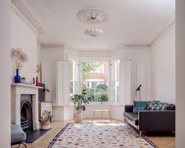
For our second move, I decided to prioritize aesthetics. We had found our dream apartment, and I wanted a dream couch to go with it. We had more space and normal-sized doors, and I was determined to get a sofa that would never show stains—a sofa as good as the ones I obsessively saved on Instagram. That’s how I landed on the Floyd Sectional—a sleek, minimalist beauty that seemed to embody the modern, put-together home I wanted to create.

There was just one problem: I had never actually sat on one before buying it.

Floyd, like many trendy furniture brands, operates largely online, which means there was no way to test it out. And even if there had been a showroom, we were still deep in the pandemic, when everything had to be purchased online for safety reasons. I scoured reviews, watched unboxing videos, and convinced myself that it must be comfortable. And for the first few weeks, I told myself it was. The low-profile design made the living room feel spacious, and its deep blue color gave the space a sophisticated, editorial feel. But then, the cracks (or rather, the gaps) started to show.

Quite literally.

The sectional’s pieces had a maddening tendency to drift apart at the slightest movement. The little alligator claws meant to hold it together did nothing of the sort, creating a chasm between seats that swallowed remote controls and made lounging feel like an extreme sport. No matter how much we adjusted it, the pieces were always slowly sliding apart like tectonic plates slowly shifting before an earthquake. It was a couch that looked stunning in photos but was a disaster in practice—perfect for Instagram, terrible for real life.

Worse, it wasn’t actually comfortable. Sure, it had better padding than the Lovesac, but the seats were oddly firm, horrible for naps. It was the kind of couch you picked for guests—not for yourself.

After a year, I was over it. We were forced to move out of our dream apartment thanks to a nightmare set off when the 75-year-old garden center next door was sold to developers. That sale triggered a full-blown chain reaction: rats moved into our walls (yes, we could hear them skittering above our heads at night), our landlords got into it with the developers, and construction trucks began rolling up in front of our bedroom between 4 and 5 a.m. daily. Then came the final straw—a hasty notice that we’d need to vacate for an unspecified amount of time so they could demo the basement to fix structural damage. So, naturally, we packed up, took the Floyd, and donated the basement Lovesac to family members who needed a couch. Only in New York, right? 

The one that finally felt like home

By the time we were shopping for our third sofa in almost as many years, the Floyd was causing actual arguments in our relationship. It was far too big for our new, much smaller apartment, and we had to reconfigure the sofa—turning a freestanding side piece into an ottoman so it would fit in our space. Often, we fought over who got the “lay down spot”—the only place where you could stretch out comfortably and watch TV without cricking your neck.

For our next couch, we had one nonnegotiable that we both agreed on: comfort. I didn’t give two figs if the couch looked like it belonged in an interior design magazine. I didn’t care what guests thought when they walked into our living room. I wanted a sofa that we could sink into at the end of the day, one that didn’t require constant adjusting or fighting for the “lay down spot.”

Ironically, after all of our trial and error—and lots of internet deep dives for options that ticked both the comfort and the price range box—we found ourselves back at the Lovesac showroom. A full-circle moment. But this time, we made better choices. Instead of defaulting to what was most practical or what looked best, we went all in on what actually felt good.

This time, we got upgraded soft cushions. We went with a slanted-back chair, optimal for reclining. We opted for a darker, stain-resistant fabric in blue chenille (because we finally accepted that we will, inevitably, spill wine on the couch). And, most importantly, we configured it as more of a daybed double lounger. (Lovesac calls it a “movie lounger” configuration—essentially a double ottoman so two people can stretch out while watching TV.) It made a coffee table in front of the couch impossible, but who needs one when you can fully stretch out? Our West Elm coffee table now lives beside the couch instead of in front of it, which I know is unorthodox, but it’s a compromise I’m more than happy to make.

It’s not the most conventionally stylish setup, but it’s the first couch that I truly love. No more fighting over the comfy spot—every seat is a comfy spot. No more reassembling pieces after they float away. For the first time, I have a sofa that actually makes me happy.

What I learned about sofas (and myself)

Looking back, I realize that my sofa journey was really about learning to prioritize my own needs. In the beginning, I chose a couch based on what was convenient. Then, I chose based on what I thought looked best. Only on the third try did I choose based on what actually mattered: my comfort.

It’s a lot like choosing a career. At first, you might go for the job that sounds the most prestigious—the one that looks impressive on LinkedIn, makes for good small talk at parties, or aligns with what other people expect of you. But after a while, you realize that none of that matters if you don’t actually enjoy the work. You’re the one who has to show up every day, deal with the demands, and live with the long-term impact of your choices. A couch is the same way. You can pick one based on what seems stylish or what you think others will admire, but at the end of the day, you’re the one who has to sink into it.

So if you’re picking a couch, here’s my hard-won advice: Forget what looks good on Instagram. Forget what your friends and family might think when they visit—they’ll deal. Buy the couch that makes you happy every single day. You won’t regret it.

Illustration by Silvia Reginato

Related Reading: 

My Dream Sofa, the Couch Doctor, and Me

My Exasperating Odyssey to Find the Perfect (Not Gray) Couch(es

it-looked-like-a-haunted-house-but-jean-wang-and-alex-warnock-smith-werent-afraid-to-live-in-a-fixer-upper-as-they-renovated-it-throughout-the-pandemic.jpg

Budget Breakdown: An Architect Couple Revamp a “Horror Show” for $191K

It looked like a haunted house, but Jean Wang and Alex Warnock-Smith weren’t afraid to live in a fixer-upper as they renovated it throughout the pandemic.

It looked like a haunted house, but Jean Wang and Alex Warnock-Smith weren’t afraid to live in a fixer-upper as they renovated it throughout the pandemic.

While most couples dream of charm and curb appeal, Alex Warnock-Smith and Jean Wang landed on the ugliest house on the street in Finchley, North London—and they couldn’t have been happier. With its drab, browny-gray pebbledash facade and a timber porch on the brink of collapse, it looked more like a haunted house than a welcoming family home. “Inside was even worse,” Alex says with a laugh. “A proper horror show.” 

But the bones were there: wider-than-usual proportions, soaring ceilings, and a four-bedroom layout. It had been sitting unloved on the market, and they snapped it up before anyone else could see its potential.

Before they bought it, Alex Warnock-Smith and Jean Wang’s home was the eyesore of the neighborhood. The architects spent £2.5K clearing the front garden and laying stepping stone paving slabs to create a side entry gate. The plants, were thoughtful hand-me-downs from neighbors and family gardens. A standout feature of the home, the original bay window is both functional and visually striking. It allows light to flood the living room, creating a bright and airy atmosphere, while its classic design remains true to the home’s original aesthetic.

Before they bought it, Alex Warnock-Smith and Jean Wang’s home was the eyesore of the neighborhood. The architects spent £2.5K clearing the front garden and laying stepping stone paving slabs to create a side entry gate. The plants, were thoughtful hand-me-downs from neighbors and family gardens. A standout feature of the home, the original bay window is both functional and visually striking. It allows light to flood the living room, creating a bright and airy atmosphere, while its classic design remains true to the home’s original aesthetic.

Photo by Kilian O’Sullivan

The plan was to move in straight away and renovate slowly. “We figured it would be messy but manageable,” says Jean. They had two young kids, full-time jobs (Alex is director of Urban Projects Bureau; Jean is a landscape designer at the same firm), and just enough optimism to believe they could make it work.

Then the pandemic hit. 

“Suddenly, we were working from home, the kids were out of school, and the place was a literal building site,” says Jean. They shuffled between rooms like human Tetris, sleeping in the kitchen one week, the back room the next. “The kids were in the living room with a hole in the wall and no heating,” says Alex. “It was grim. But also…kind of exhilarating?”

Alex and Jean meticulously refurbished the home’s doors and coving. For the couple, retaining as many original elements as possible was a priority, though they did have a budget in mind.

Alex and Jean meticulously refurbished the home’s doors and coving. For the couple, retaining as many original elements as possible was a priority, though they did have a budget in mind.

Photo by Kilian O’Sullivan

Alex and Jean filled the living area with furniture from their previous homes. New double-glazed timber-sash windows and custom shutters—a £38,000 splurge—flood the space with light.

Alex and Jean filled the living area with furniture from their previous homes. New double-glazed timber-sash windows and custom shutters—a £38,000 splurge—flood the space with light. 

Photo by Kilian O’Sullivan

See the full story on Dwell.com: Budget Breakdown: An Architect Couple Revamp a “Horror Show” for $191K
Related stories:

large.jpg

How to Navigate Renovation Costs in the Age of Tariffs

Stop panic-hoarding building materials and get familiar with one word: contracts.

In January, a colleague was remarking on an ongoing renovation project to transform her attic into a primary bedroom and bath. When the word “tariff” started leaking into the home renovation lexicon, she began chatting with neighbors about how she might avoid fluctuating prices, material delivery delays, and going over budget. One suggested purchasing all the major supplies now, and storing them in a shed for when permits go through and construction could begin. Imagining a Tuff Shed packed with two-by-fours, electrical conduit, insulation, bathroom tile, a toilet—it all felt somewhat dystopian.

Today, however, just one month after the Trump administration announced sweeping duties on imported goods (and shortly thereafter provided a 90-day pause on most), hoarding materials doesn’t sound like such a bad idea, especially since experts are mixed on how tariffs will impact the renovation market; USA Today sources estimate increases ranging widely—anywhere from single digits to 25 percent. But they do agree that homeowners can shield themselves from price hikes and fluctuations without postponing building their dream home, or piling up supplies in their backyards.

Though the Architecture Billings Index, the AIA’s measure of nonresidential construction, has been soft for some time, home renovations have remained a booming business. Since a light lull after a Covid-fueled surge, homeowners have been embracing change, perhaps as a way to cope with an ugly real estate market. “People are staying in their existing homes and improving them, and they’re often funding those improvements with home equity lines of credit,” explains Liz Young, founder and CEO of Los Angeles start-up Realm, which guides clients through construction and renovation projects. It can make more financial sense to renovate a home than buy a new one, adds Young.

After crunching numbers on recent renovation projects in California and the greater Seattle area (where Realm operates), Young’s team has reason to believe tariffs will have little impact on total costs in those areas—around two percent in West Coast markets. “For our average customer, when we look at the percentage of the project that is an imported material, it’s actually quite low. And most of the project costs are at least half labor,” she says. Perhaps contrary to the industry’s tariff anxieties, Young notes that she’s actually seeing a surge in project inquiries of late. “Given that 2026 holds more uncertainty, this actually creates a motivation to do these projects sooner than wait.”

“The best thing to do is get multiple quotes, but one thing I think people often skip is asking for a sample contract.”

—Keefer Dunn, architect

Planning ahead can be critical to larger home renovation projects since you can secure material prices before adjusted tariff announcements and avoid resulting product delays, says Young. Many of the contractors her company works with offer “price locks,” which guarantee the cost of specific materials over a period of time. While most won’t hold prices indefinitely, many will secure them for several months, she says.

Price locks are just one of several possible tools homeowners can use to secure materials costs. The AIA, which offers contracts and documents to architects and builders, also cites a “cost plus a fee” structure, known simply as cost-plus, wherein a homeowner can pay a contractor for work based on the actual cost incurred in procuring the materials or equipment, plus a fee to cover overhead, profit, and other ancillary costs.

Price locks are just one of several possible tools homeowners can use to secure materials costs. AIA Contract Documents, which offers contracts and documents to architects and builders, also cites a “cost plus a fee” structure, known simply as “cost-plus,” wherein a homeowner can pay a contractor for work based on the actual cost incurred in procuring the materials or equipment, plus a fee to cover overhead, profit, and other ancillary costs. According to the company’s director of counsel and content development, Alisa Schneider, this type of compensation structure is particularly useful for projects with less-defined scopes of work, or where the costs may be uncertain.

“Often these agreements also envision that total payments to the contractor will be capped at an agreed to Guaranteed Maximum Price (“GMP”),” Schneider said in an email. “The GMP gives an owner certainty as to the amount they will be obligated to pay and normally represents the contractor’s estimate for the actual cost, plus a contingency for unanticipated costs, and the contractor’s fee.” The parties might also use a shared savings clause in their cost-plus agreement establishing that a contractor will be paid a percentage of any costs saved or avoided, encouraging them to control pricing for materials and labor. Commonly used, also, are contract allowances—a way for clients to provide a cost maximum for supplies that are susceptible to price changes.

When looking at project costs, Young recommends working closely with an architect or design-build group to ensure that the scope of work is clearly mapped out from the beginning. Young says that one of the biggest contributors to renovation price increases are change orders, wherein parts of a project shift and incur additional fees. She notes that a homeowner can push for a “No Change Order” clause in a contract, but if that isn’t possible or there are upheavals in the scope of work, price locks and allowances could provide some protection from material price volatility.

While legally-binding contract clauses can provide peace-of-mind to homeowners, at the root of a smooth project is finding a transparent contractor, says Chicago architect Keefer Dunn. “There are many different ways that contractors structure their contracts, especially in smaller scale renovations. The best thing to do is get multiple quotes, but one thing I think people often skip is asking for a sample contract.” Sample contracts, says Dunn, help clients understand how contractors structure their payments, how they think about owner-supplied materials, and more. These contracts can demonstrate contractor professionalism, and make evident whether processes and pricing are transparent.

“Contractors will break down their costs in very different ways. It’s more standardized for large projects or new construction projects. If you’re working below $500,000, it’s the Wild West—it’s very difficult to compare apples to apples, but you can look and see who is breaking down cost of labor versus cost of materials,” explains Dunn. “Are they saying the price is $40,000 and they’re breaking it out into 30 different line items? Those kinds of things help you understand where the costs are coming from.”

While DYing a renovation could cut labor expenses, in many cases, collaborating with a team of professionals can actually lower material costs by leveraging their existing relationships. Young says Realm’s connections to suppliers often means significant discounts on finishes and fixtures, for example. Trusted builders can also easily calculate extra costs that could be “layered in” among tariffs. Adds Young, “When you have a supply chain that has multiple transaction points, I think it comes down to making sure that you have a trusted contractor ensuring that you’re not being ripped off, and they’re not being ripped off along the way.”

Related Reading:

What Trump’s Tariffs Could Mean for Home Building—and the Housing Crisis

Buying a Prefab ADU Was Supposed to Be Easier Than This